WordPress and Bricks build kit
Everything needed to rebuild this design in WordPress with Bricks Builder: hex colors, responsive spacing and type variables, component specs, downloadable assets and the rules the build has to follow.
Colors
Register these as the Bricks global color palette. Hex values are exact.
Brand crimson
#C1012F
--rg-crimson
Logo red. Accents, focus rings, underlines only
Primary teal
#00918B
--rg-primary
Buttons, links, icons
Primary text on teal
#F9FCFF
--rg-primary-contrast
Label color inside teal buttons
Ink
#0C242A
--rg-ink
Headings and body text
Muted text
#57666A
--rg-muted-text
Supporting copy
Page background
#F7FBFD
--rg-bg
Default page background
Paper
#EFF4F8
--rg-paper
Alternating section band
Paper deep
#DFEAF0
--rg-paper-deep
Gradient end, deeper band
Card
#FFFFFF
--rg-card
Cards and panels
Border
#C0D1D7
--rg-border
Hairlines, 1px
Accent teal
#ADD8D4
--rg-accent
Soft teal fills
Blue soft
#B0DBD7
--rg-blue-soft
Location and info panels
Gold
#A28137
--rg-gold
Metallic accent, stars, list markers
Gold soft
#ECE0C8
--rg-gold-soft
Highlight cards
Steel
#83A5AE
--rg-steel
Secondary accent
Steel soft
#C2DDE4
--rg-steel-soft
Section wash
Slate teal
#89B8BD
--rg-slate
Checks, confirmations
Slate soft
#D2EAEC
--rg-slate-soft
Section wash
Danger
#CE4039
--rg-danger
Form errors only
Responsive type scale
Lora for headings, Nunito Sans for body. Every size is a clamp, so no per breakpoint font overrides are needed in Bricks.
| Role | Variable | Value | Notes |
|---|---|---|---|
| Hero H1 | --rg-fs-hero | clamp(1.7rem, 1.15rem + 2.4vw, 3.25rem) | Lora 600, line-height 1.08 |
| Section H2 | --rg-fs-h2 | clamp(1.375rem, 1.05rem + 1.4vw, 2rem) | Lora 600, line-height 1.15 |
| Card H3 | --rg-fs-h3 | clamp(1.0625rem, 1rem + 0.35vw, 1.25rem) | Lora 600, line-height 1.25 |
| Lead paragraph | --rg-fs-lead | clamp(1.0625rem, 1rem + 0.4vw, 1.25rem) | Nunito Sans 400, line-height 1.65 |
| Body | --rg-fs-body | clamp(0.9375rem, 0.9rem + 0.2vw, 1rem) | Nunito Sans 400, line-height 1.7 |
| Small / meta | --rg-fs-sm | clamp(0.8125rem, 0.79rem + 0.12vw, 0.875rem) | Nunito Sans 400 |
| Button label | --rg-fs-btn | clamp(0.875rem, 0.85rem + 0.15vw, 0.9375rem) | Nunito Sans 600 |
Responsive spacing
Gaps, margins and padding all scale with the viewport. Use the variable, never a fixed pixel value.
| Use | Variable | Value | Notes |
|---|---|---|---|
| Section padding block | --rg-space-section | clamp(3rem, 2rem + 4.5vw, 6rem) | Top and bottom of every section |
| Container max width | --rg-container | 78rem (1248px) | Centered, never wider |
| Container gutter | --rg-gutter | clamp(1.25rem, 0.9rem + 1.2vw, 2rem) | Left and right inline padding |
| Column gap | --rg-gap-col | clamp(1.5rem, 1rem + 2vw, 2.5rem) | Between two-column halves |
| Card grid gap | --rg-gap-card | clamp(1rem, 0.85rem + 0.6vw, 1.25rem) | Between cards in a grid |
| Card padding | --rg-pad-card | clamp(1.25rem, 1.1rem + 0.7vw, 1.75rem) | Inside cards and panels |
| Stack rhythm | --rg-stack | clamp(0.75rem, 0.65rem + 0.4vw, 1.25rem) | Between stacked text blocks |
| Heading to body | --rg-space-heading | clamp(0.75rem, 0.65rem + 0.5vw, 1.25rem) | Gap under a heading |
Radius
- Button999px (pill)
- Card16px
- Panel / image24px
- Hero image / large panel32px
- Pill tag12px
Shadows
Soft
inset 0 1px 0 0 rgba(255,255,255,.6), 0 8px 20px -14px rgba(12,36,42,.28)
Lift
0 18px 40px -26px rgba(12,36,42,.38)
Paste this into Bricks custom CSS
:root {
  --rg-crimson: #C1012F;
  --rg-primary: #00918B;
  --rg-primary-contrast: #F9FCFF;
  --rg-ink: #0C242A;
  --rg-muted-text: #57666A;
  --rg-bg: #F7FBFD;
  --rg-paper: #EFF4F8;
  --rg-paper-deep: #DFEAF0;
  --rg-card: #FFFFFF;
  --rg-border: #C0D1D7;
  --rg-accent: #ADD8D4;
  --rg-blue-soft: #B0DBD7;
  --rg-gold: #A28137;
  --rg-gold-soft: #ECE0C8;
  --rg-steel: #83A5AE;
  --rg-steel-soft: #C2DDE4;
  --rg-slate: #89B8BD;
  --rg-slate-soft: #D2EAEC;
  --rg-danger: #CE4039;

  --rg-fs-hero: clamp(1.7rem, 1.15rem + 2.4vw, 3.25rem);
  --rg-fs-h2: clamp(1.375rem, 1.05rem + 1.4vw, 2rem);
  --rg-fs-h3: clamp(1.0625rem, 1rem + 0.35vw, 1.25rem);
  --rg-fs-lead: clamp(1.0625rem, 1rem + 0.4vw, 1.25rem);
  --rg-fs-body: clamp(0.9375rem, 0.9rem + 0.2vw, 1rem);
  --rg-fs-sm: clamp(0.8125rem, 0.79rem + 0.12vw, 0.875rem);
  --rg-fs-btn: clamp(0.875rem, 0.85rem + 0.15vw, 0.9375rem);

  --rg-container: 78rem;
  --rg-space-section: clamp(3rem, 2rem + 4.5vw, 6rem);
  --rg-gutter: clamp(1.25rem, 0.9rem + 1.2vw, 2rem);
  --rg-gap-col: clamp(1.5rem, 1rem + 2vw, 2.5rem);
  --rg-gap-card: clamp(1rem, 0.85rem + 0.6vw, 1.25rem);
  --rg-pad-card: clamp(1.25rem, 1.1rem + 0.7vw, 1.75rem);
  --rg-stack: clamp(0.75rem, 0.65rem + 0.4vw, 1.25rem);
  --rg-space-heading: clamp(0.75rem, 0.65rem + 0.5vw, 1.25rem);

  --rg-font-display: "Lora", Georgia, serif;
  --rg-font-body: "Nunito Sans", system-ui, sans-serif;
  --rg-radius-card: 16px;
  --rg-radius-panel: 24px;
  --rg-radius-hero: 32px;
}

.rg-section { padding-block: var(--rg-space-section); }
.rg-container { width: 100%; max-width: var(--rg-container); margin-inline: auto; padding-inline: var(--rg-gutter); }
.rg-card { background: var(--rg-card); border: 1px solid var(--rg-border); border-radius: var(--rg-radius-card); padding: var(--rg-pad-card); }
h1 { font-family: var(--rg-font-display); font-size: var(--rg-fs-hero); line-height: 1.08; letter-spacing: -0.015em; }
h2 { font-family: var(--rg-font-display); font-size: var(--rg-fs-h2); line-height: 1.15; }
h3 { font-family: var(--rg-font-display); font-size: var(--rg-fs-h3); line-height: 1.25; }
body { font-family: var(--rg-font-body); font-size: var(--rg-fs-body); color: var(--rg-ink); background: var(--rg-bg); }
:focus-visible { outline: 2px solid var(--rg-crimson); outline-offset: 2px; }
Buttons
Call (primary)
Background #00918B, label #F9FCFF, pill, height 44px desktop / 40px mobile, inline phone icon, padding 0 20px
Directions (secondary)
Background #B0DBD7, label #0C242A, pill, same height, pin icon
Outline
1px #C0D1D7 border, transparent fill, label #0C242A, hover background #EFF4F8
Text link
#00918B, underline on hover, offset 4px, hover color #C1012F
Assets
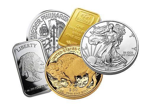
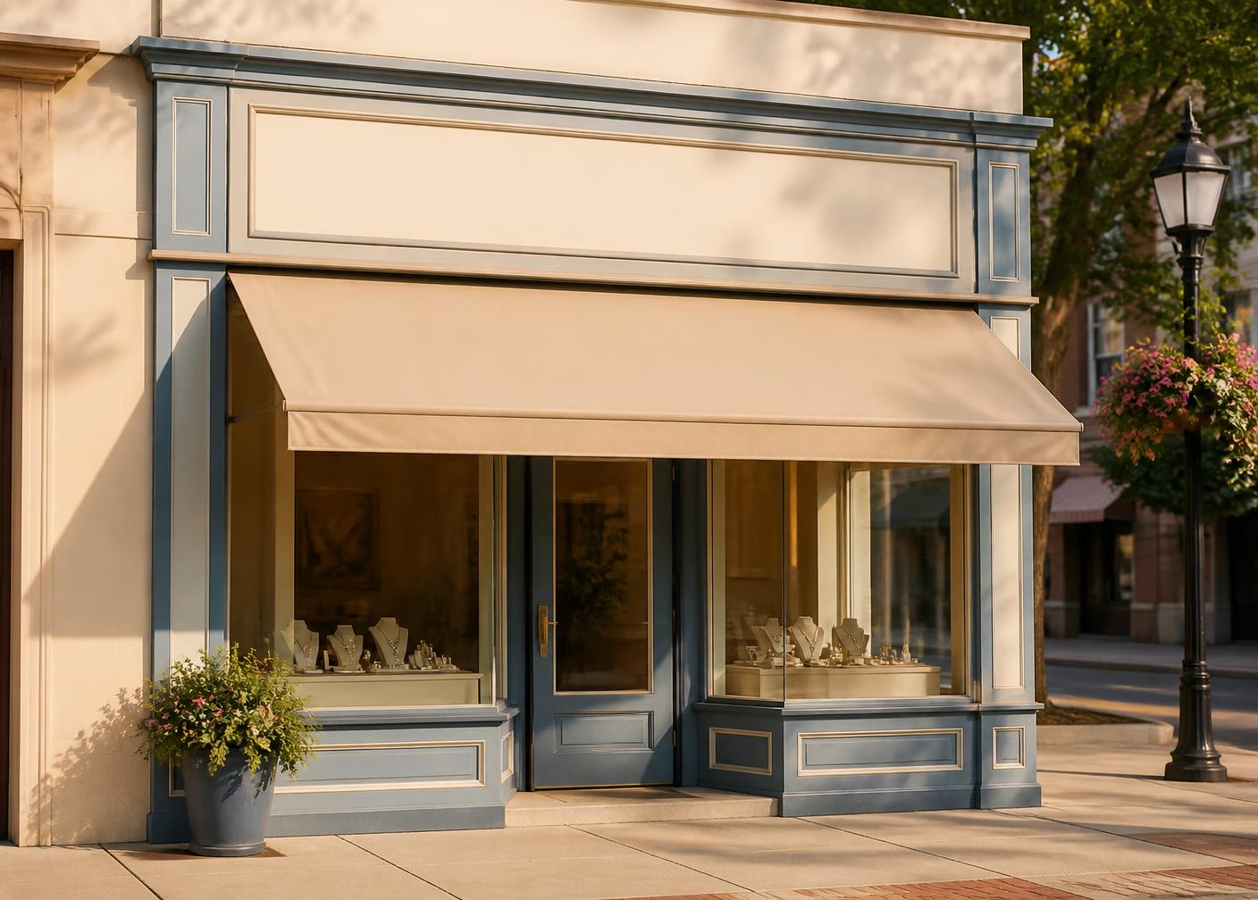
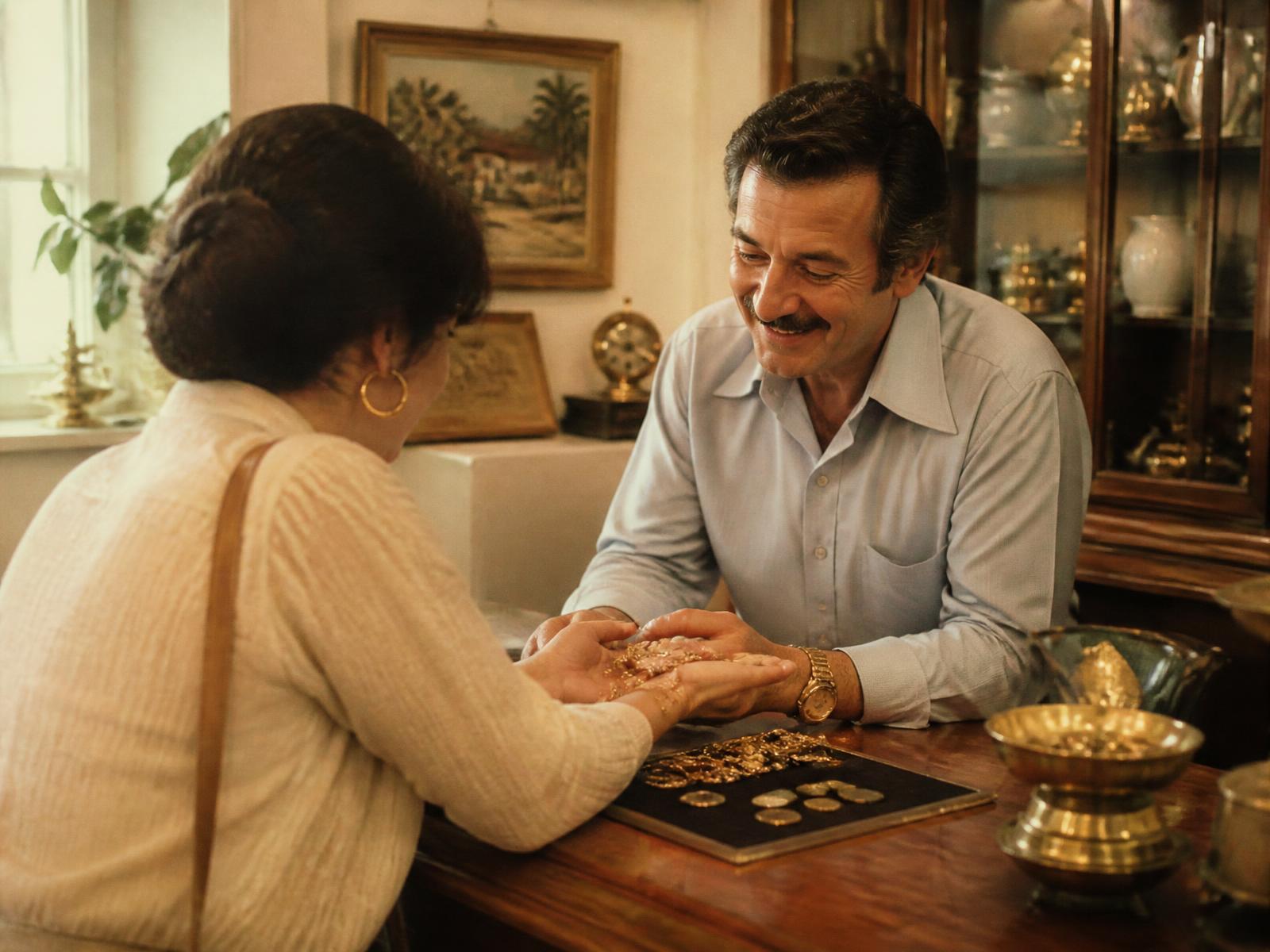
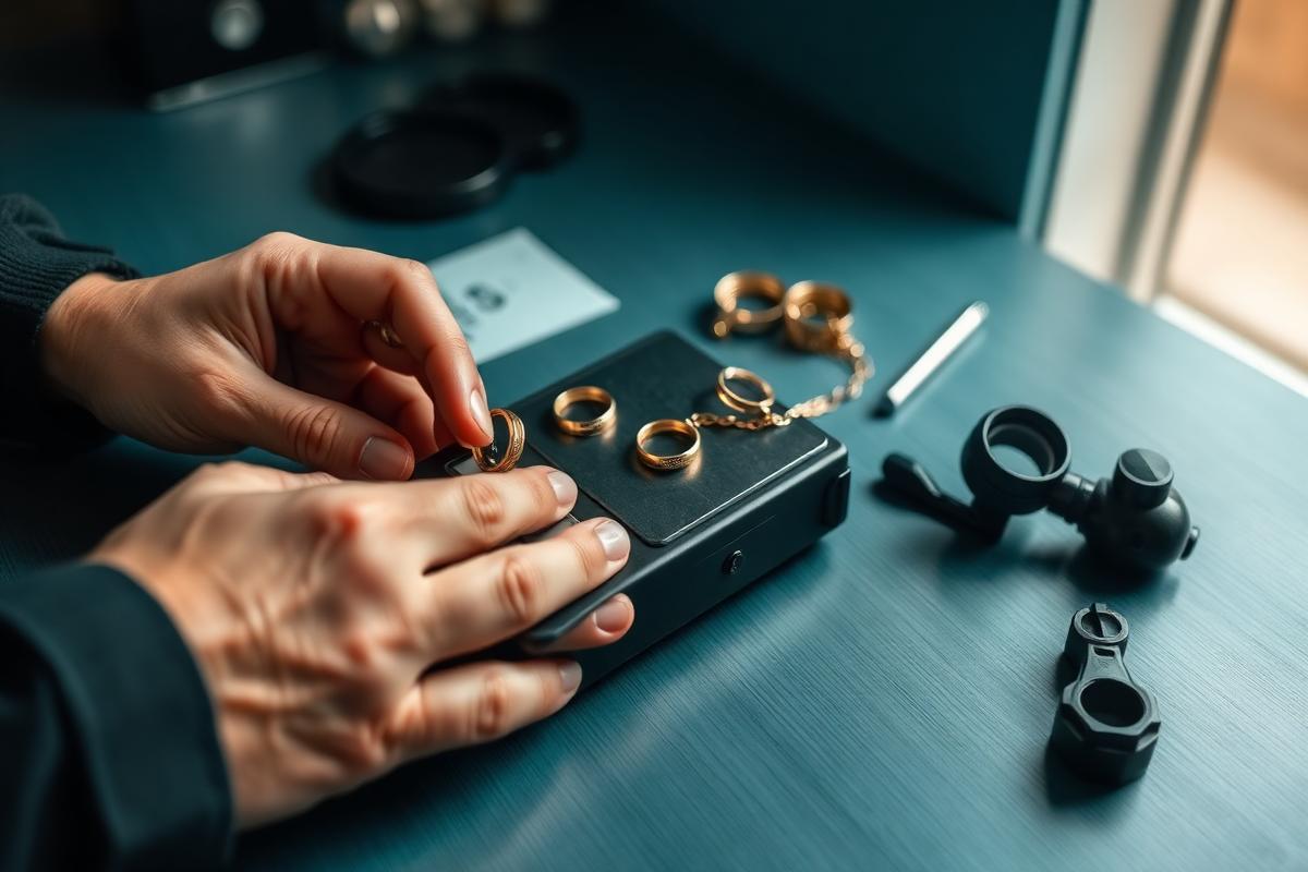
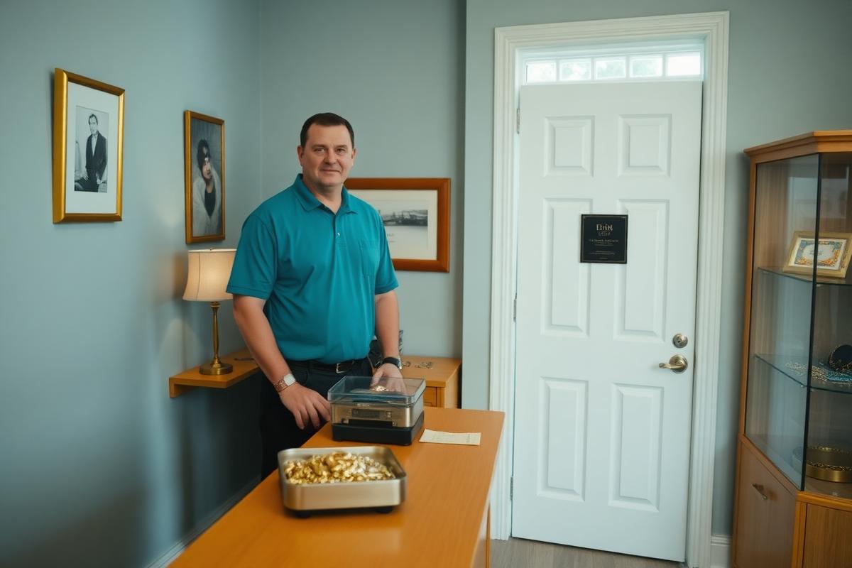
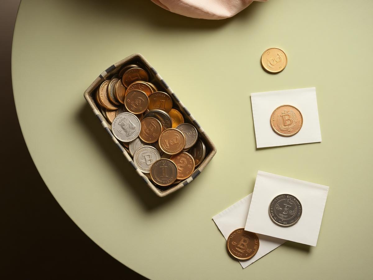
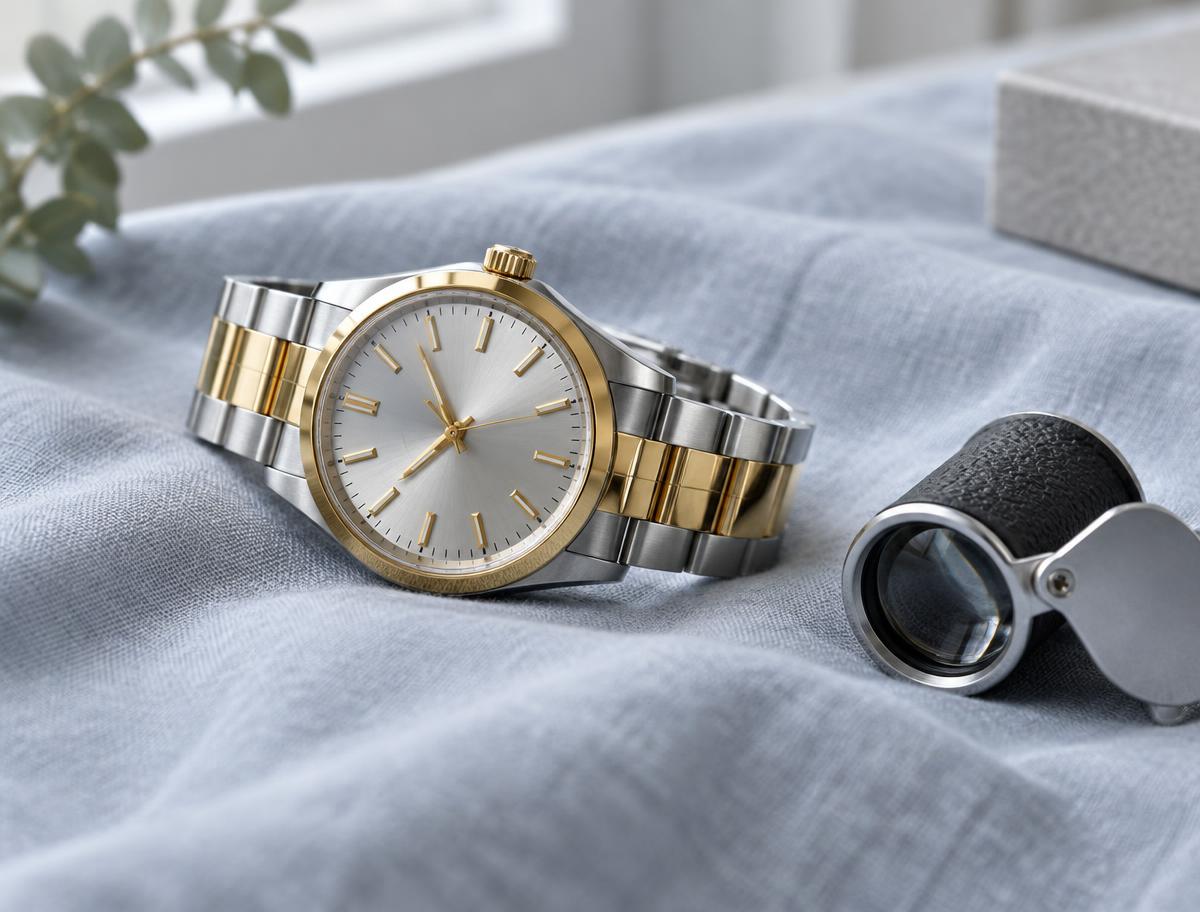
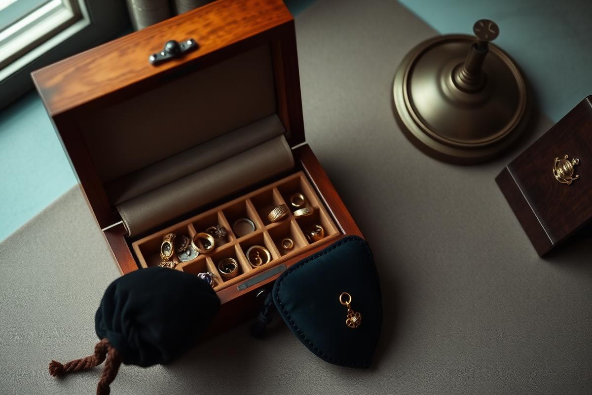
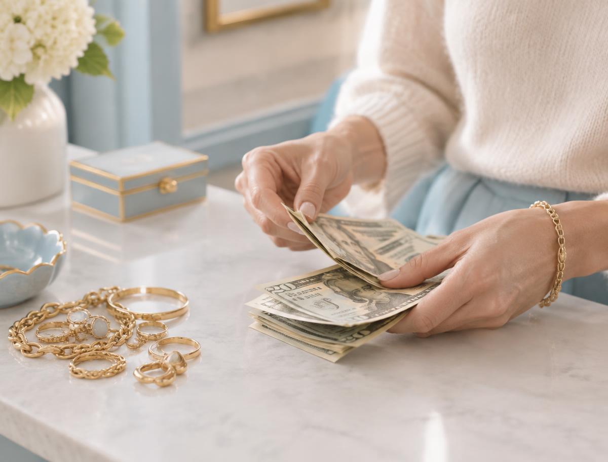
Click any file to download the full resolution original for the WordPress media library.


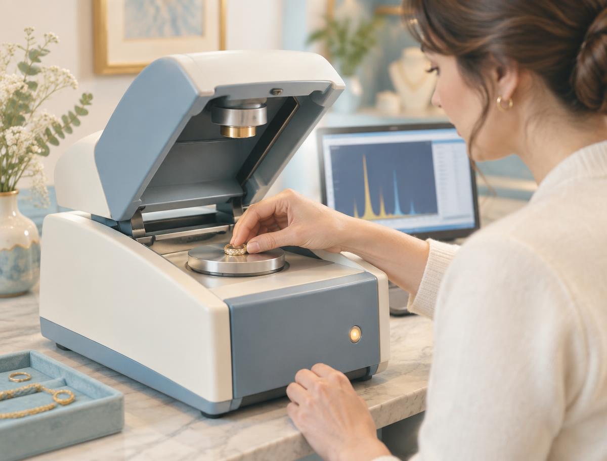



Bricks setup
- Install Bricks (child theme active) plus ACF Pro, Rank Math, and WP Rocket. No page builder other than Bricks.
- Bricks > Settings > Theme Styles: set the container width to 1248px and the gutter to the --rg-gutter clamp.
- Register all colors above as a Bricks global color palette named Rancho Gold, using the exact hex values. Never pick a raw color inside an element.
- Add the font and spacing variables to Bricks > Settings > Custom code > Custom CSS under :root, then use var(--rg-*) in element styling.
- Load Lora (600) and Nunito Sans (400, 600, 700) with a self-hosted local font in Bricks > Custom fonts. Do not hotlink Google Fonts.
- Build Header and Footer as Bricks templates with condition Entire website. Build one reusable Section template per repeated block.
- Create global classes, not ID styles: rg-section, rg-container, rg-card, rg-btn-call, rg-btn-directions, rg-heading-hero, rg-heading-section.
- Use Bricks breakpoints at 478px, 767px, and 991px. All type and spacing use the clamps above, so only layout changes per breakpoint.
Components to build as Bricks templates
Header
Logo left, main nav center-right, phone link with crimson phone icon right. Sticky on scroll. Mega menu for What We Buy with five columns.
Mobile bar
Fixed bottom bar, background #0C242A at 85% with backdrop blur. Menu, Get Directions, phone number. Hides on scroll down, reveals on scroll up or after 1.8s idle.
Hero
Two columns desktop with text left, image right at 3:2, radius 32px. On mobile the image comes first.
Service cards
Image top, H3, short paragraph, unique CTA text link. Grid of 3 desktop, 2 tablet, 1 mobile.
Steps
Sticky stacking cards left, sticky image right on desktop. No numbers, no buttons.
Reviews slider
Speech bubble cards, oversized quote mark, five stars, avatar initial, arrows plus dots. Splide or Bricks nestable slider.
FAQ
Bricks accordion, image left, questions right on desktop. FAQPage schema on the page.
Location
Lazy loaded Google Maps iframe, address, hours, phone and email all at body size.
Footer
Five link columns desktop. On mobile the columns collapse into accordions. Crimson gradient strip at the top.
Content rules
- Never use em dash characters in any copy.
- Never place a small sub-title or eyebrow label above a heading.
- Every phone number is a tel: link and every address links to the Google Business listing.
- Crimson #C1012F is a highlight only: hairlines, focus outlines, hover states, quote marks, active dots. Never a button fill or a large area.
- One H1 per page, then a logical H2 and H3 order.
- No live chat, no SMS CTA, no prominent lead form. Phone calls and store visits are the goals.
- Every image gets descriptive alt text, explicit width and height, and lazy loading below the fold.
SEO and technical checklist
- Unique title under 60 characters and meta description under 160 characters per page.
- Permalinks kept exactly: /whatwebuy, /goldjewelry, /aboutus, /find-us, /contact, /sell-gold, /sell-silver, /sell-jewelry, /sell-coins, /inherited-items, /what-we-sell, /how-it-works.
- 301 redirects from /what-we-buy to /whatwebuy and /about to /aboutus.
- LocalBusiness plus PostalAddress schema sitewide, Service schema per buying page, FAQPage schema where FAQs appear.
- XML sitemap and robots.txt via Rank Math.
- Serve WebP, compress under 200KB per image, lazy load below the fold.
- GA4 and Tag Manager containers with conversion events phone_click, directions_click and contact_submit wired to the data-conversion attributes.
- Core Web Vitals check and mobile QA at 375px, 768px and 1440px before launch.
Business details to hard code
- Name: Rancho Gold & Jewelry
- Phone: (702) 626-0000
- Address: 4590 N. Rancho Dr Ste 1, Las Vegas, NV 89130
- Hours: Monday to Friday 10:00 AM to 5:00 PM, Saturday 10:00 AM to 3:00 PM, Sunday closed